KMR Marketing
Context
Conducted user research, interviews, and usability testing to inform the design of a responsive website for KMR Marketing, ensuring an intuitive experience for users to explore past work, services, and request consultations.
Role: UI/UX Researcher and Designer
Tools used: Figma, Figjam
Duration: 12 weeks


User Research and Insights
-
I compared four different marketing agencies website and discovered that most emphasized a quick and easy process for scheduling consultations, prioritizing user convenience. However, a notable trend was the lack of upfront pricing information, suggesting a focus on personalized service offerings tailored to client needs.
-
I conducted user interviews with five participants where it was revealed that businesses face challenges when selecting a marketing agency due to the overwhelming number of options and limited transparency in pricing, often needing to reach out for rate information. Participants expressed a desire for more trust, clearer visibility of services, rates, and past projects on agency websites. Additionally, while some prefer the comprehensive approach of a full team, many find working with a single point of contact more personable and effective.
Ideation and Design Process
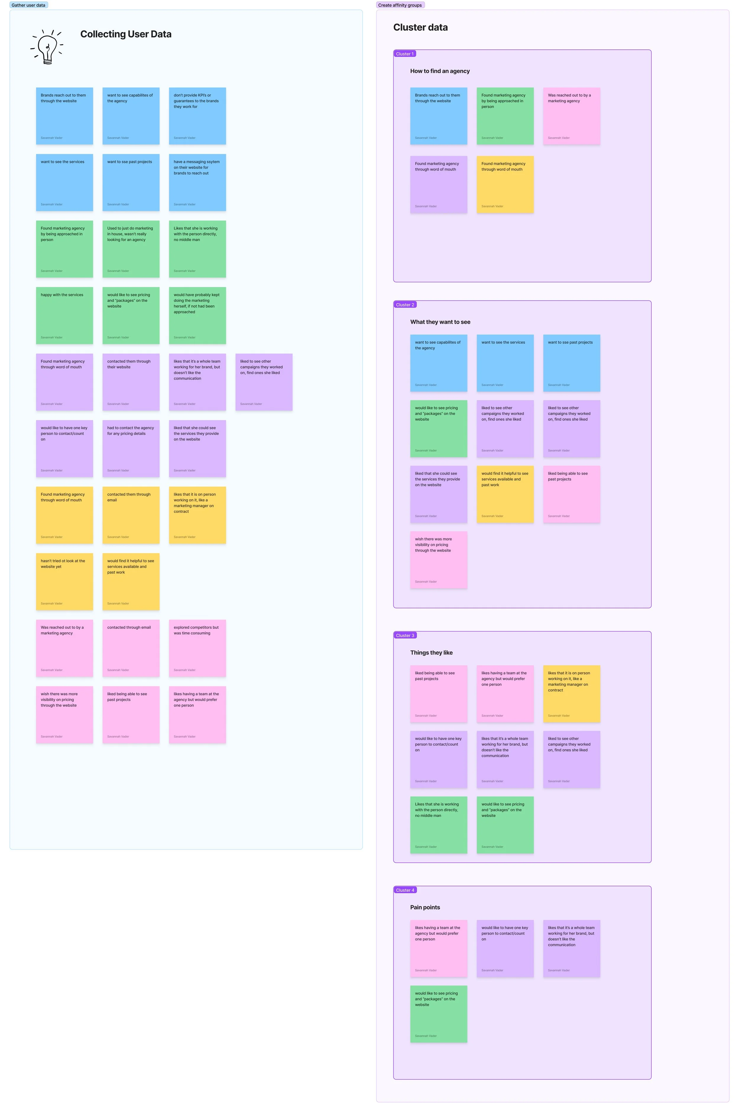
Affinity mapping
From the user interviews, I took the key points from each interview and organized them into categories to find the main pain points.
2. User Persona
From the user interviews I was able to come up with two user personas to help get into the thinking of designing for the end users.
3. Problem Statement, POV, and HMW
After finding the common pain points among users and creating the user persona, I came up with a problem statement, POV, and HMW to help think about possible solutions.
Problem Statement
Brands and small businesses are often confused when trying to see what a marketing agency has to offer leading them to feel overwhelmed with having to book a meeting to discuss the services.
POV
Shelby is a small business owner trying to increase her marketing efforts. She wants to hire someone to take on this part of the business for her but doesn’t have a lot of time to figure it out. She would like to hire a third party to do it for her, but finds it difficult to see what online what would be included in the services.
HMW
How might we create a straightforward way to showcase the services of KMR Marketing and what a client can expect to pay?
4. Feature Set
To brainstorm features to add to the app to solve this problem for users I created a feature set and categorized them to prioritize the features that were most important: a way to contact the agency, see services offered, and past work.
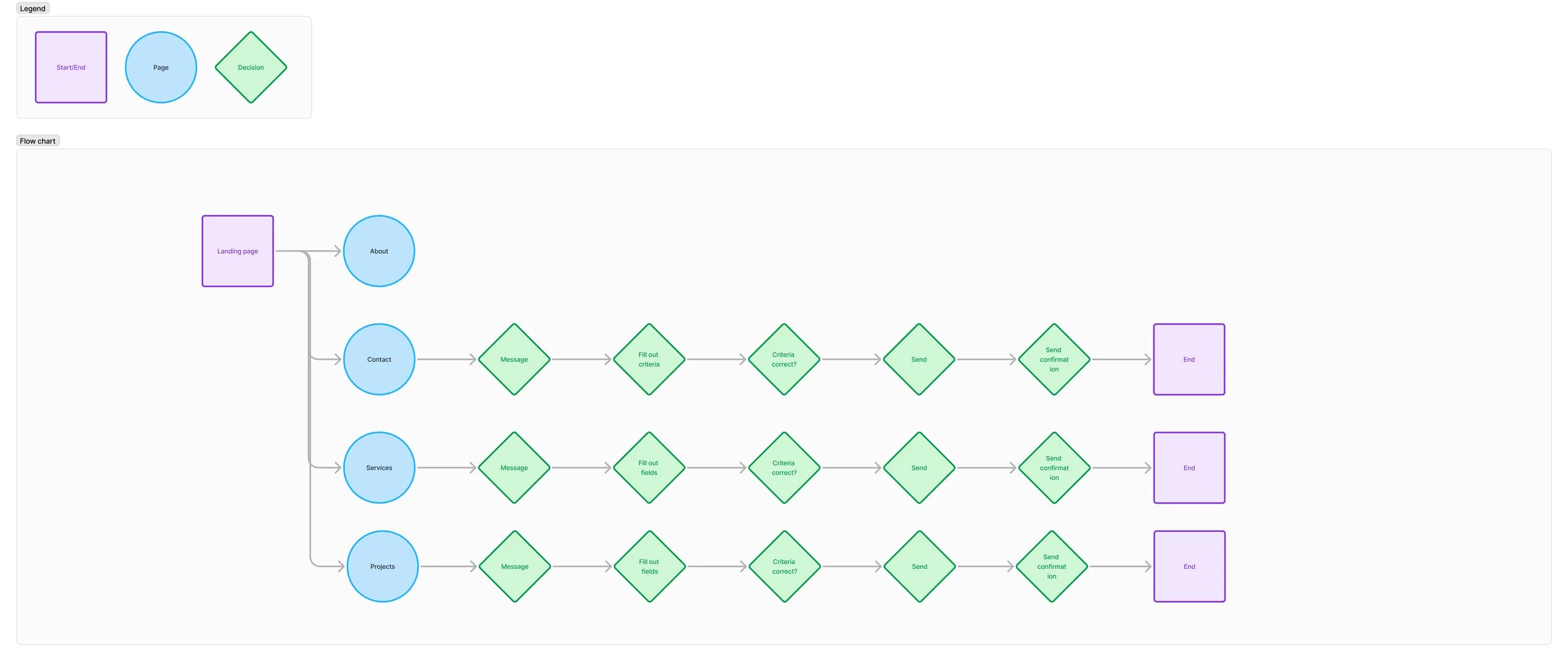
5. User Flow
To help figure out which screens I would need to develop, I created a user flow.
6. Low-fi Wireframes
Next, I developed some low-fidelity wireframes to see how they would all come together
7. Usability Testing
Objective:
To gain user insight into what is effective and intuitive while finding what can be improved in terms of design, accessibility, and functionality.
Task Flow:
Request a consultation.
Success Metrics:
Task success rate: Were the users able to complete the task without errors or assistance?
Learnability: Is the design intuitive and easy to follow?
Findings:
All participants completed the task and appreciated the option to click the "request consultation" button in multiple places, with most finding this feature helpful. Two out of three participants did not like how busy the landing page was and said it was distracting. The overall feedback highlighted that users found the app easy to use, visually appealing, and readable.
8. Branding
I created the branding for a client that captured her company's essence of being simple, fun, and unique, blending minimalist design with playful, distinctive elements to make the brand both approachable and memorable.
9. Iterations
With the feedback from the usability testing and a meeting with the client, I made the below iterations.
Added branding, increased the white space for readability, got rid of the busy photos to draw more attention to the CTA buttons, updated the “services” section to be more cohesive, and moved the secondary action buttons to the bottoms of sections to influence users to scroll through the page.
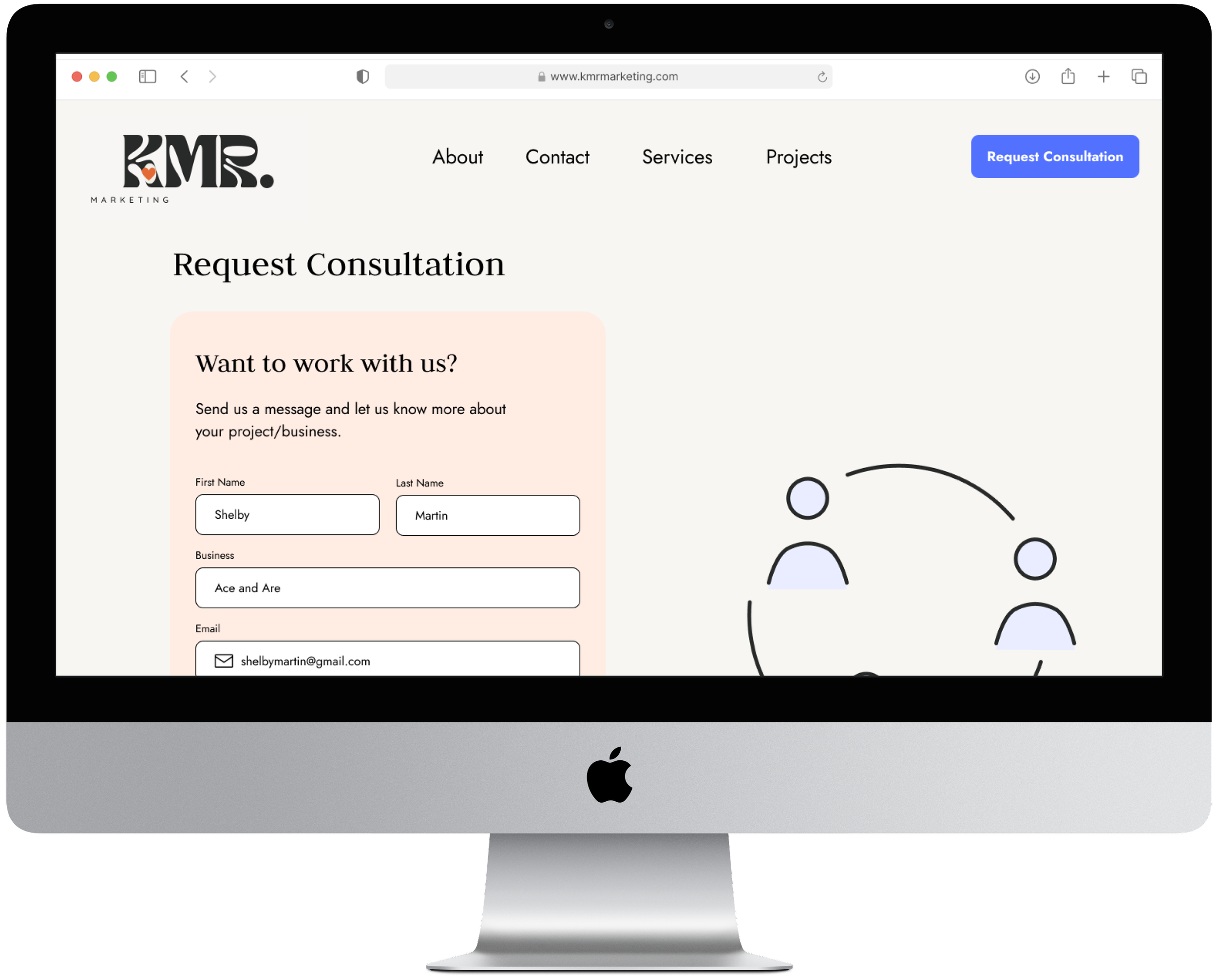
Updated form legibility by adding labels, left aligned for readability and page cohesion, and added graphic on the right to balance the page.
10. High Fidelity Mockups
Once I came up with the branding I applied it to my low fidelity wireframes along with some of the changes and iterations I made from the feedback from the usability testing.


Next Steps and Reflection
Next Steps
Reflection
Add a news page to share new marketing strategies that the agency is implementing
Develop a more interactive messaging system within the website
Create case studies for each project to better showcase the agency’s work
Designing a responsive website for a marketing agency was a comprehensive process that involved thorough research, user interviews, and competitive analysis to inform the design strategy. Going through each step—from wireframing and prototyping to user testing—allowed me to create a site that was not only visually appealing but also functional and user-centered. This project deepened my understanding of responsive design principles and taught me how to align business goals with user needs, which will be invaluable in future projects.


